
A #NYFW Special Report
Words & Interviews by Frozen in Carbonite
Photo Collages by Requiem For A Screen
Skating writ large prides itself on a “no rules, bro!” ethos. #Menswear, an entity with which skating has become increasingly intertwined of late (via Vogue Skateboarding Magazine, etc.), has all kinds of rules. No black belt with brown shoes. No wearing white after Labor Day. One’s tie can’t go past one’s belt. Skating has no such faux pas — except for MAYBE brand-mixing — i.e. one can’t wear a Venture shirt if one is skating Indys or Vans socks if you’re wearing Nikes.
But what if I told you that skaters have curated their own sartorial code for decades — painstakingly color-coordinating their shoes, shirts, hats, and even spots? However, the modern-day thrift store aesthetic has left color-coordination by the wayside, even as color-blocking seemed to make a comeback last year, or some shit. So, in conjunction with New York Fashion Week, enjoy this retrospective of color coordination while you’re waiting to get into the Wang party or whatever.
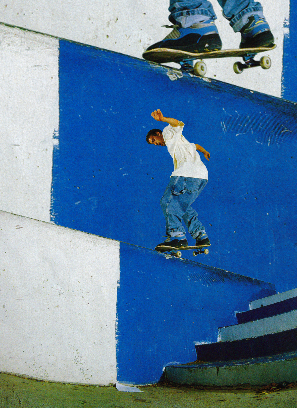
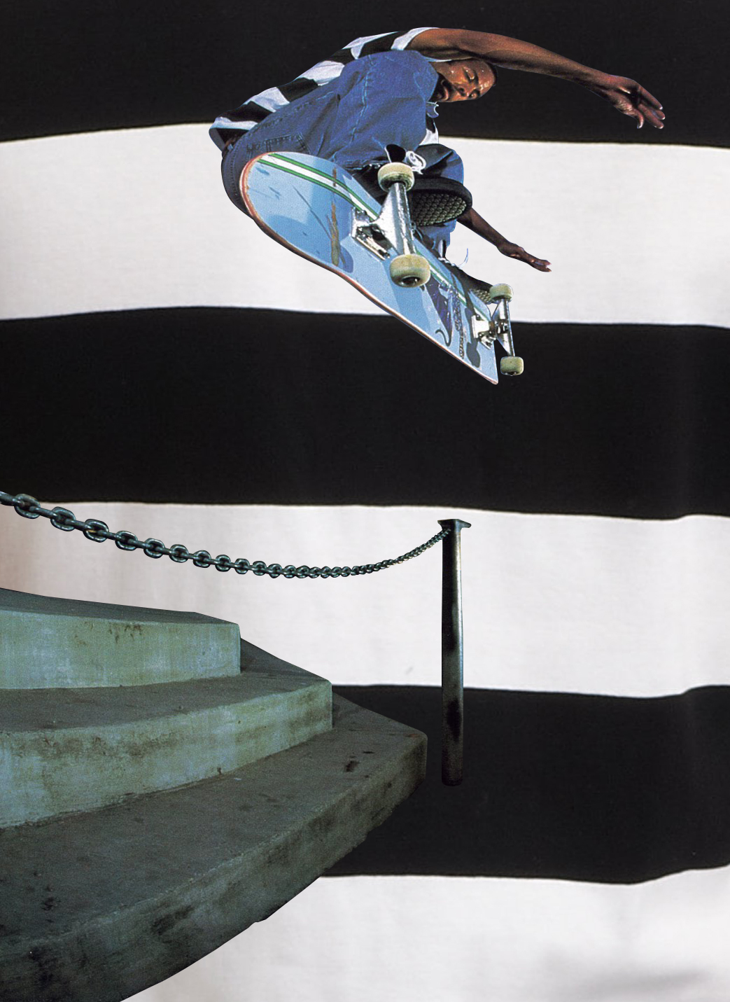
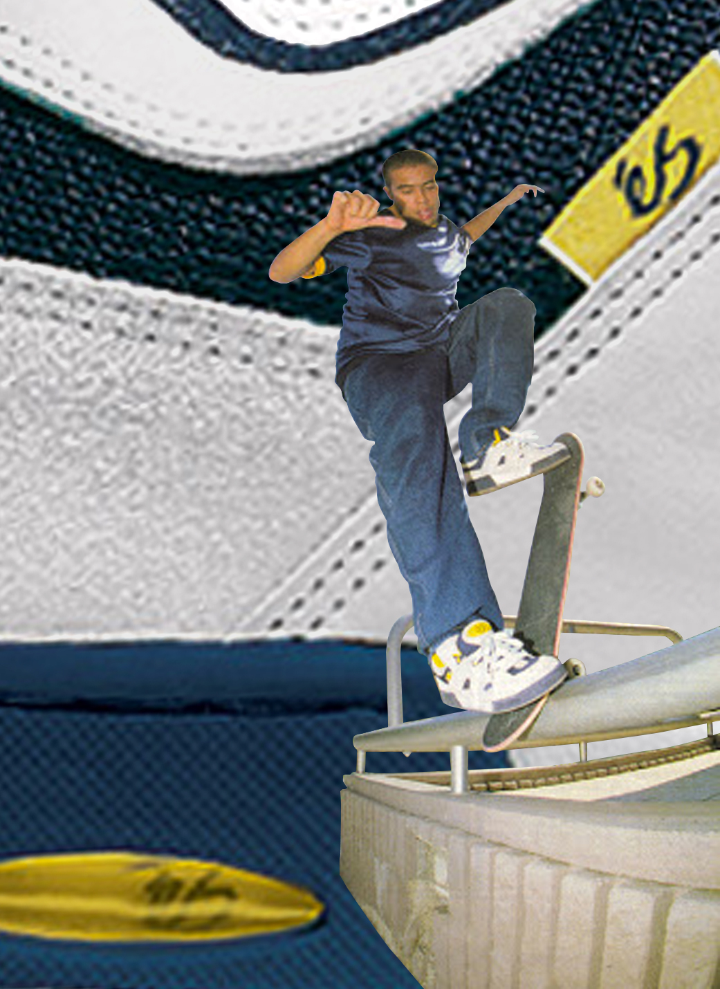
Mike Santarossa [top]
The rare shoe/shirt/hat hat trick. Note the period-specific flat brim.
Jovontae Turner [lower]
Flannel shirts had long been a staple of skaters worldwide, but only Jovontae could make some of the most garish mustard-yellow Airwalks look cool when paired with a yellow and black one and some [Polo maybe?] khakis that matched the neutral tones of Embarcadero’s hallowed ledge formations.
Harold Hunter
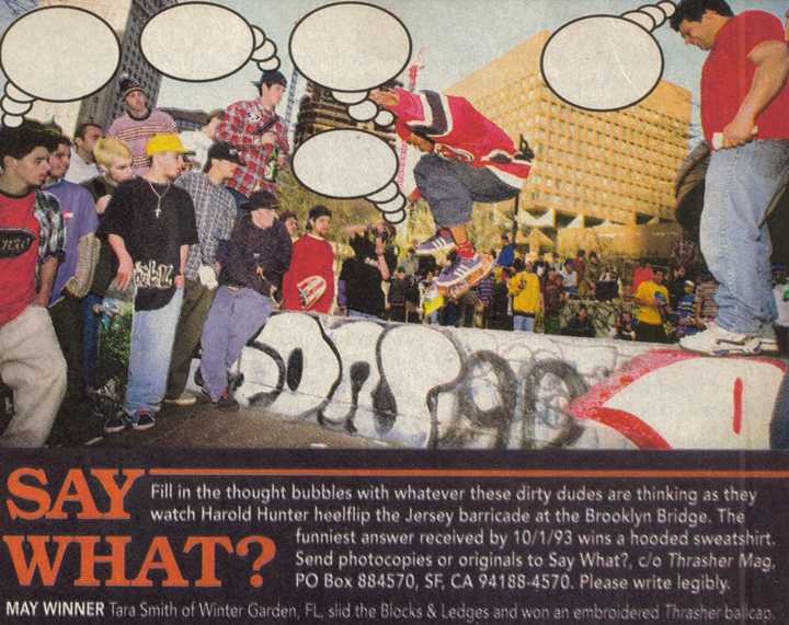
Imagine a state of mind so fashion-forward that you coordinate your socks, shoelaces, and New Jersey Devils jersey. In addition, your jeans and [pre-skate program] Adidas Campuses match. Then you atttend perhaps the most infamous east coast “contest” ever and backside 180 heelflip the banks wall. Legends never die.
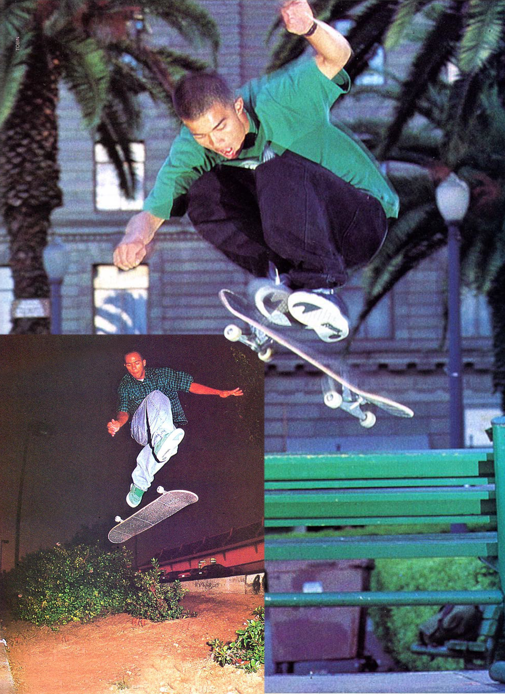
Rob Carlyon [top]
It was impossible to pick up a skate mag in ‘92-95 without seeing San Francisco’s Union Square green benches. Here, Rob Carlyon pop-shove-its over one in an ensemble that coordinates with both the bench and the adjacent non-native foliage.
Sal Barbier [lower lefthand corner & below]
One of the true innovators of applying elements of sartorial style to skating, Sal matched a rare Etnies Rap colorway with a green/white Rick Howard Shirt™. This outfit also accentuates the dusk sky, local vegetation, and the architecture of the local casual dining establishment. Below, black shoes with white laces are rare these days, but Sal matches them with what has to be a Ralph Lauren striped polo.
Stevie Williams
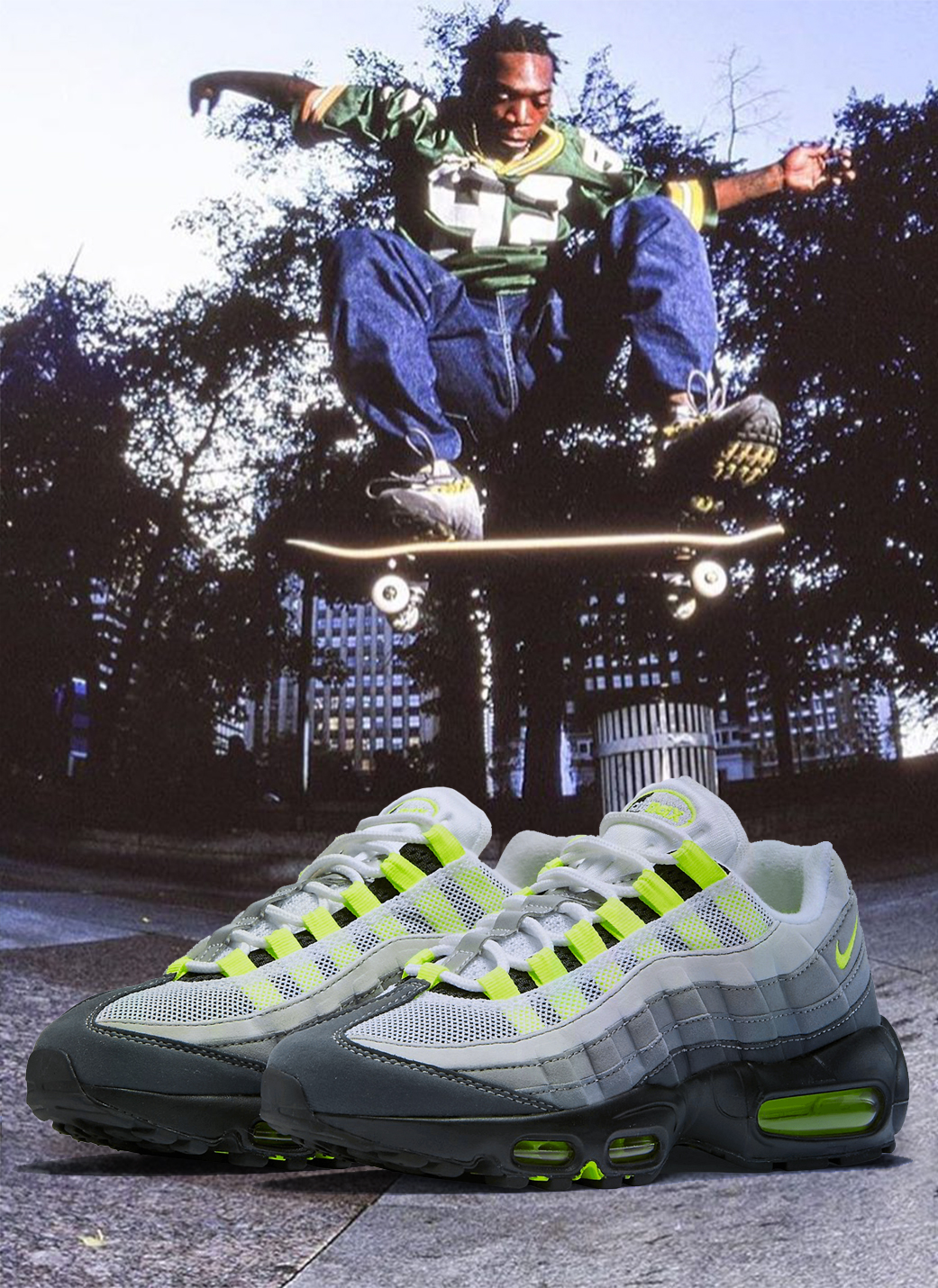
This unbelievable photo begs the question: did he cop the Air Maxes to go with the Reggie White jersey or vice versa?
Jimmy Gorecki
How into color coordinating your gear were you in the late 90s, 2000s?
I based it off the color of my hat, then went from hat to footwear, and mixed everything in between. The white tee was the common denominator. Skate shoes put more emphasis on their color palettes back then. When you look back to Kalis having an all-red shoe, or Kerry having the maroon and white DVS — that was easy to match with a Phillies hat or whatever.
Can you describe one outfit that you remember wearing, or someone else wore that was particularly color-coordinated?
One of my favorite outfits — and this is partially because I helped the gentleman get it — was Rob Welsh grabbed a camo Celtics fitted, and a Larry Bird jersey with tearaway pants. This was the prime Mitchell & Ness era of the early 2000s. I forget what Lakais he wore with it, but it all tied together nicely. I thought that was special because I didn’t have money to buy Mitchell & Ness stuff back then. I think he went to Puerto Rican Park and did the nollie bluntslide in it that same day.
Did you ever coordinate a board graphic and your gear?
I had a Milwaukee Brewers hat — it was blue and yellow — and this weird Aesthetics board where 3/4 of the board was bright yellow and the bottom was like a Morrocan city or something. Those graphics were some of the more obscure ones. It was by complete accident, but it tied together.
Did you have any specific color preferences?
Sixers red, blue and white. That was the height of the era where people wore jerseys, and the height of the Iverson era, so there was never a prouder time to be a Sixers fan. Your hat matched your jersey, then you tied it to Girbaud jeans or whatever.
Why do you think color coordination has fallen by the wayside as of late in skateboarding?
Because these kids skate with bell-bottoms on. They’re on some whole other shit. But I like the early 2000s revival that’s going on.
The Yellow Shirt Era
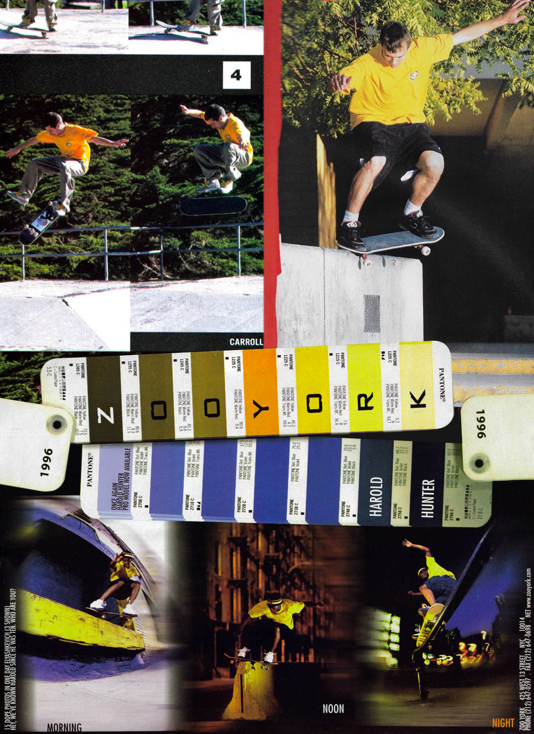
Our colleagues over at Dime chronicled this particular epoch in skate history. As anyone who lived through it will attest, a yellow shirt provides an almost infinite canvas for color-coordination, whether through laces like Carroll (ever the innovator, upper left), the first Mariano Axion combined with the festive lights of Center City Philadelphia (Kevin Taylor, below), or local greenery in conjunction with “safety paint” (Rick Howard, upper left).

Though this Quim photo might be Peak Yellow.
Eric Koston
What the hell did we call those nylon shirts that skate brands started making in the late Nineties– Jerseys? Tech shirts? Was dri-FIT even a thing? In any event, Koston’s first pro model came in a slew of a colorways that facilitated color coordination. However, I think a Lakers colorway didn’t show up until the Koston 2.

Bobby Puleo
In addition to yellow, the other two primary colors also dominated the late-90s. The aforementioned Puerto Rican Park thus became one of the most photogenic spots, a trait that the noted spot connoisseur (above center) took advantage of with this ensemble.
Sean Kelling
Contrasting colors set the tone for a successful #fit. Along those lines, the myriad of DC Lynx colorways, combined with its distinctive paneling, inspired some unforgettable color coordination, like Sean Kelling (above left) nosegrinding some Philly steps somewhere in New York
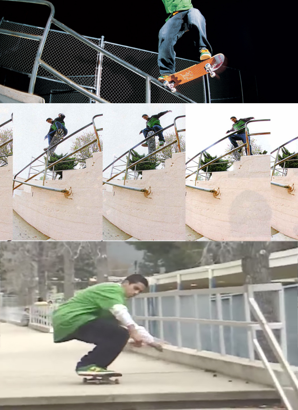
Guy Mariano
I will go to my grave with the belief that the second Guy Mariano Axion pro model, the Aries, skated well. Guy’s 2000 Skateboarder cover is on an almost Mondrian-esque level of color-coordination, incorporating the turn-of-the-century staple carpenter jean. And in one of his final photos before his pre-Fully Flared exile, Guy delivered one of the most color-blocked nosegrinds in history (headliner photo.)
Paul Rodriguez
We may never know when the yellow shirt era ended and the thermal-under-t-shirt era began — however, the emergence of a slew of Dunk colorways coincided with the latter. New avenues for color coordination ensued, along with the popularity of XL [at the very least] t-shirts, which brings us to P-Rod, one of this ensemble’s most innovative practitioners…
How into color coordinating your gear were you in the early 90s, 2000s?
I couldn’t go out of the house unless I had it dialed in. My shirt had to match my shoes, and if I was wearing a hat, then my pants had to match the hat.
Can you describe one outfit that you remember wearing or someone else wore that was particularly color-coordinated?
My favorite skater, especially back then, was Tom Penny. When you look at me when I was 18 and younger, I just wanted to be Tom Penny. I noticed he’d always match his shirt with his shoes, and his pants with his beanie. A color that really stands out to me with him is the brown suede éS Accels that he would always wear, with either the same matching color shirt — or the white shirt with the blue jeans and the matching brown beanie. That was the epitome of Tom looking like the coolest guy I had ever seen.
Did you ever coordinate a board graphic and your gear?
Nah, I never took it to that extreme. Maybe by happenstance, but it was never planned out. Just the fit had to be right. Fortunately, I get a lot of boards, and that’d be a struggle to go through because a board might only last one day.
Did you have any specific color preferences?
Right around 2003, I was really into baby blue and light pink. That was around the time that Cam’ron was doing the pink thing. And that brown suede color — to this day — if I come across even a shirt in that golden brown, always sticks out to me. I’m open to all colors; if I have the right shoes to go with it, I’ll run it, even if it’s a bit louder than usual.
Why do you think color coordination has fallen by the wayside as of late in skateboarding?
It’s just waves. The style in skateboarding right now is similar to 1993, 1994. I’m looking at it like next year will be 1995, 1996, so I think that it’ll catch back up.
It’s just the cycle we’re in. Everyone was up on color coordination, and certain people decided they needed something else to differentiate themselves. Everyone will get up on that, and then the tastemakers will jump to the next thing. The cargoes are coming back now, and when I was 14, that was my whole style — now they’re back and it’s like “oh, I’m on the bandwagon now?”
Previously: The 30 Phattest Outfits in Skate Video History — 1992-2012
I swear that Puerto Rican Park Welsh ad was somewhere. Its not on CBI. We fuckin need it. Someone help plz
Stoked on the Rob Carlyon and Sean Kelling mentions, two stellar Hawaiian skate practitioners, also the carpenter jean shoutout made me feel a certain way.
Good article. Thought provoking. What about wade desarmo from Kayo it’s official?
Lotti’s all yellow fit?
That Stevie photo is fucking golden. How does one non-ironically skate a pair of 95’s???